Using Neutrals as a Backdrop for Bold Vibrant Hues
Over the last few years we’ve been inundated with rooms filled with bright whites and cool greys, beautiful combinations of tone on tone neutrals with a calm and sophisticated feel. On the opposite end of the colour spectrum sit rich saturated tones of deep colour. Now, more and more we are seeing neutrals as a backdrop for bold vibrant hues that bring a splash of colour to a room, and it’s a welcome change.
Neutrals As A Backdrop
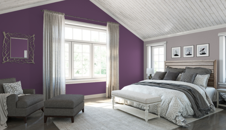 Shades of whites & greys are still extremely popular, but now we are seeing neutrals as a backdrop for a feature colour. The latest update to the neutral family is Greige, a combination of contemporary grey & warm earthy beige tones. Using a gorgeous neutral for your base colour means you have multiple options for bringing a bright or bold colour into the room. Pantone’s Colour of the Year for 2018 is Ultraviolet, a vivid shade of purple . When a bold bright colour is introduced as colour of the year, we tend to see similarly-saturated tones in other colours gain in popularity. While purple may not be your first choice for a wall colour, there are many other options of deep jewel tones to work with. Think shades of emerald, sapphire, and fuschia as some examples.
Team Your Bright With a Matching Neutral
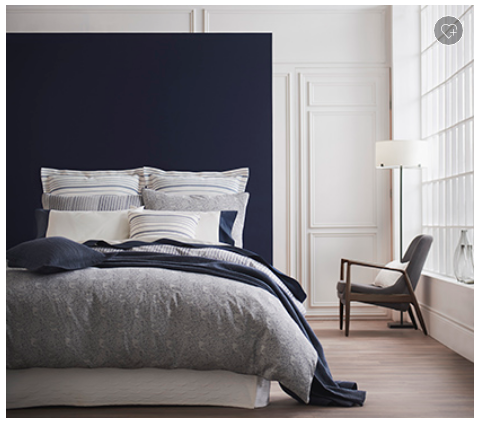
 The trick to adding a bold pop of colour is to team your bright with a matching neutral. Look to the undertones of the colour to pair it with the right bright. For example, a cooler grey will look sophisticated when paired with a blue that has cool undertones. This combination of Benjamin Moore’s Southern Belle and Silver Cloud are a good example.
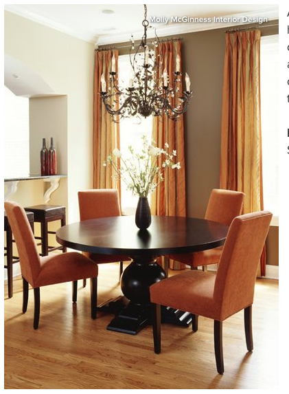
Because Greige has a warm undertone, it can paired well with an accent colour that is also warm. It looks great with a dark & spicy orange like pumpkin. Try Benjamin Moore’s Carrot Stick with Equestrian Gray.
If you’re looking to a add touch of pink to a room, there are many shades to choose from. From the paler tones of Millenial Pink to a bright hot fuchsia pink, jewel toned options are endless.
Paint A Feature Wall
 The trick when designing a room with big bold colours is to not go overboard. The brighter or bolder the colour, the less you need of it… meaning you don’t need three emerald walls to make a statement. Think in terms of dressing yourself. You wouldn’t wear a red dress with red shoes, red nails, red jewellery, and a red bag. You may accent your black dress with red accessories, but you might also add some pieces in gold to compliment the look. Dressing a room is exactly the same process. Paint a feature wall and accessorize in similar & complimentary accent tones, and the finished product will make a bold impressive statement.
Create A Cohesive Look
 If you’re unsure about painting a whole wall in a bright colour, try adding a few accessories that bring in the colour in small doses. It’s a great way to experiment and figure out which colours work and what you like or don’t like. Try a piece of furniture like a side chair or area rug, something that is big enough to make an impact without taking over the space. Try to create a cohesive look where the feature colour is seen in little pops around the room, similar to your dressing technique. Think feature wall, area rug and some throw pillows on the sofa as an example, & don’t make it too matchy-matchy.

Use varying shades of the colour so it’s not overwhelming. You can bring in some pieces that have a different patterns and mix with neutrals, so you’re not being overpowered with one feature shade throughout the room. Art is a great way to introduce multiple shades or tones of colour that tie everything together.
Have some fun with this! It’s a great way to bring in a bit of pizazz to any room!
Have you tried designing a room with a big bold colour? Let us know how it went!
Photos courtesy of Benjamin Moore.